Skip to content

CineVegas Film Festival

Brand design, print, and digital work for CineVegas, the Las Vegas international film festival: festival campaigns, CineFile magazine, illustration, and the CineSlots iOS app.

BrandingPrintIllustrationiOSUX
Role
Art Director
Year
2005–2009
Client
CineVegas Film Festival
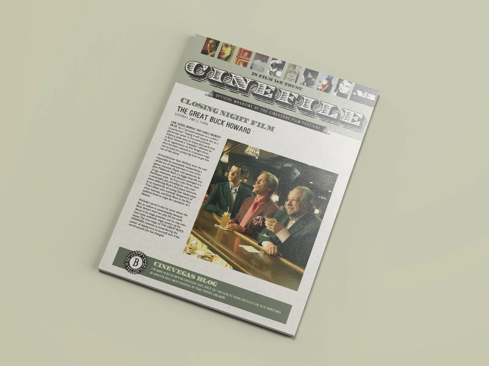
A CineFile magazine cover for CineVegas Film Festival photographed on a pale green surface.

CineVegas was the Las Vegas international film festival, a desert-noir counterpart to Sundance with a taste for cult cinema, emerging directors, and whatever could only make sense in Las Vegas. I worked on print, illustration, and digital for five festival years.

The best CineVegas work understood the setting. It did not try to make the festival look more respectable by sanding off the city around it. It used the city as material: neon, casinos, pulp, road-trip ephemera, old Hollywood, bad sleep, good movies.

2006: The World’s Most Dangerous Film Festival

The 2006 identity paired a blunt flame mark with a red, black, and white system that could stretch from a pocket guide to stage branding. The pieces had to work at two very different distances: in an attendee’s hand and across a crowded festival room.
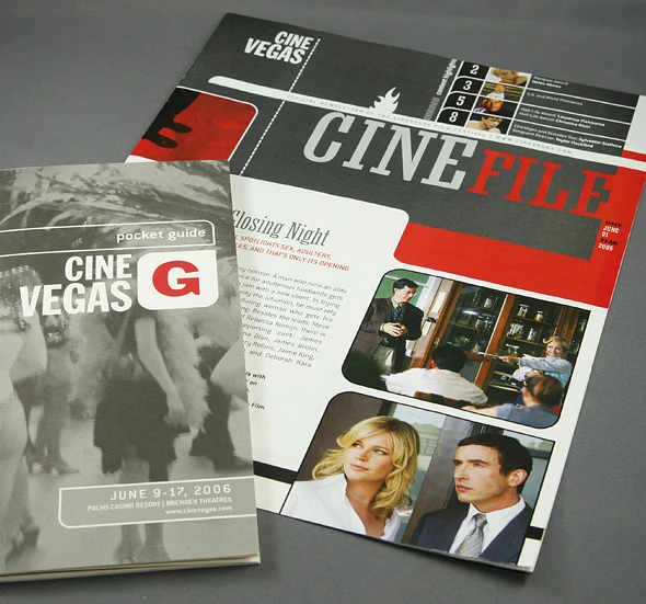
The 2006 CineFile magazine and CineVegas pocket guide arranged together on a gray surface.
CineFile and the pocket guide: the larger editorial piece carried the daily schedule while the smaller guide kept the festival in a jacket pocket.
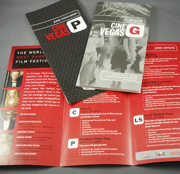
The CineVegas pocket guide and pass information materials arranged over an open red brochure.
Pass materials: one system organized ticket levels, festival access, and the deliberately overheated claim that CineVegas was “the world’s most dangerous film festival.”
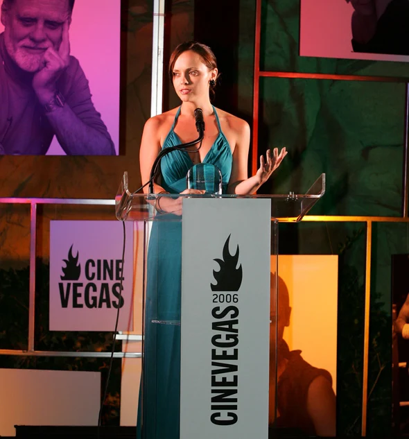
A speaker stands behind a clear podium branded with the 2006 CineVegas flame mark.
Podium and stage branding: the compact flame mark stayed legible against a busy event set.
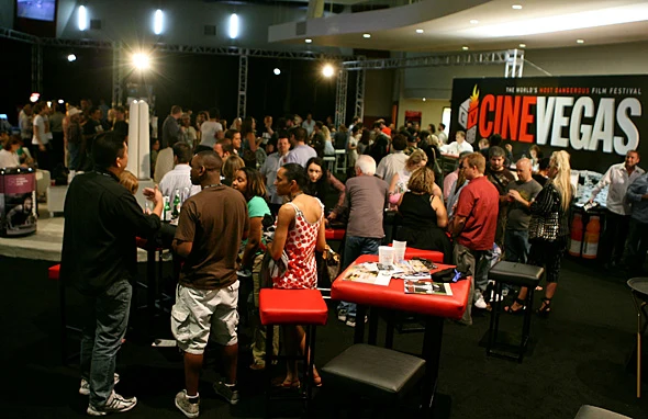
Festival attendees gather in a crowded reception space beneath a large CineVegas wall graphic.
Festival reception: the wordmark became environmental signage, large enough to hold the far wall of a crowded room.
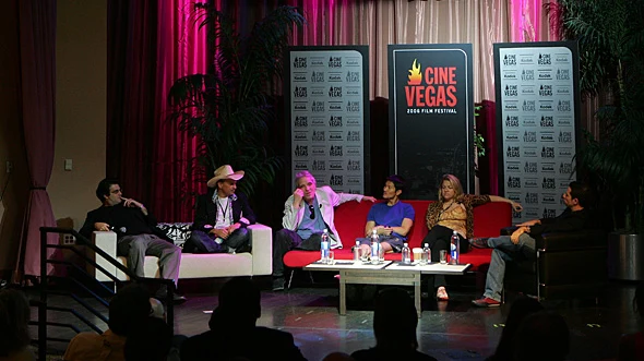
Six panelists sit on a festival stage framed by CineVegas signs and press backdrops.
Panel staging: freestanding signs and repeating press backdrops carried the identity through a live program without competing with the people onstage.

2007: Greetings From CineVegas

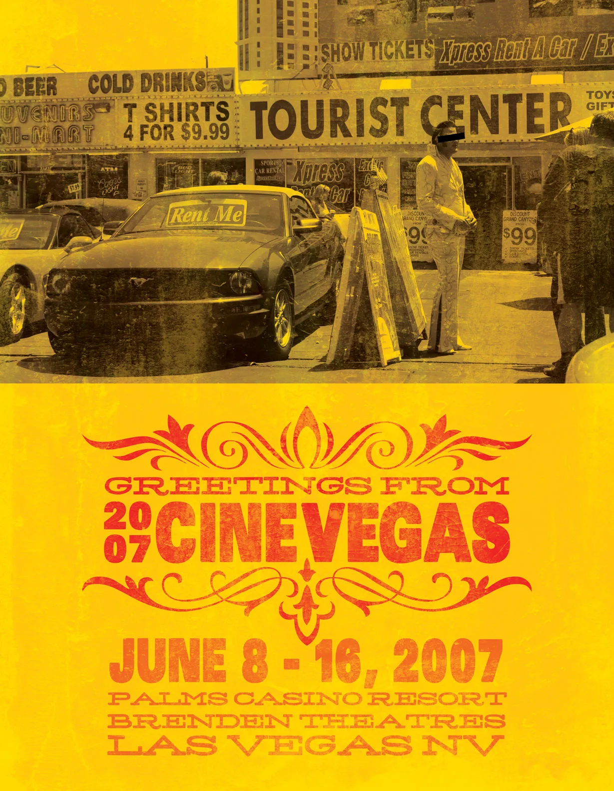
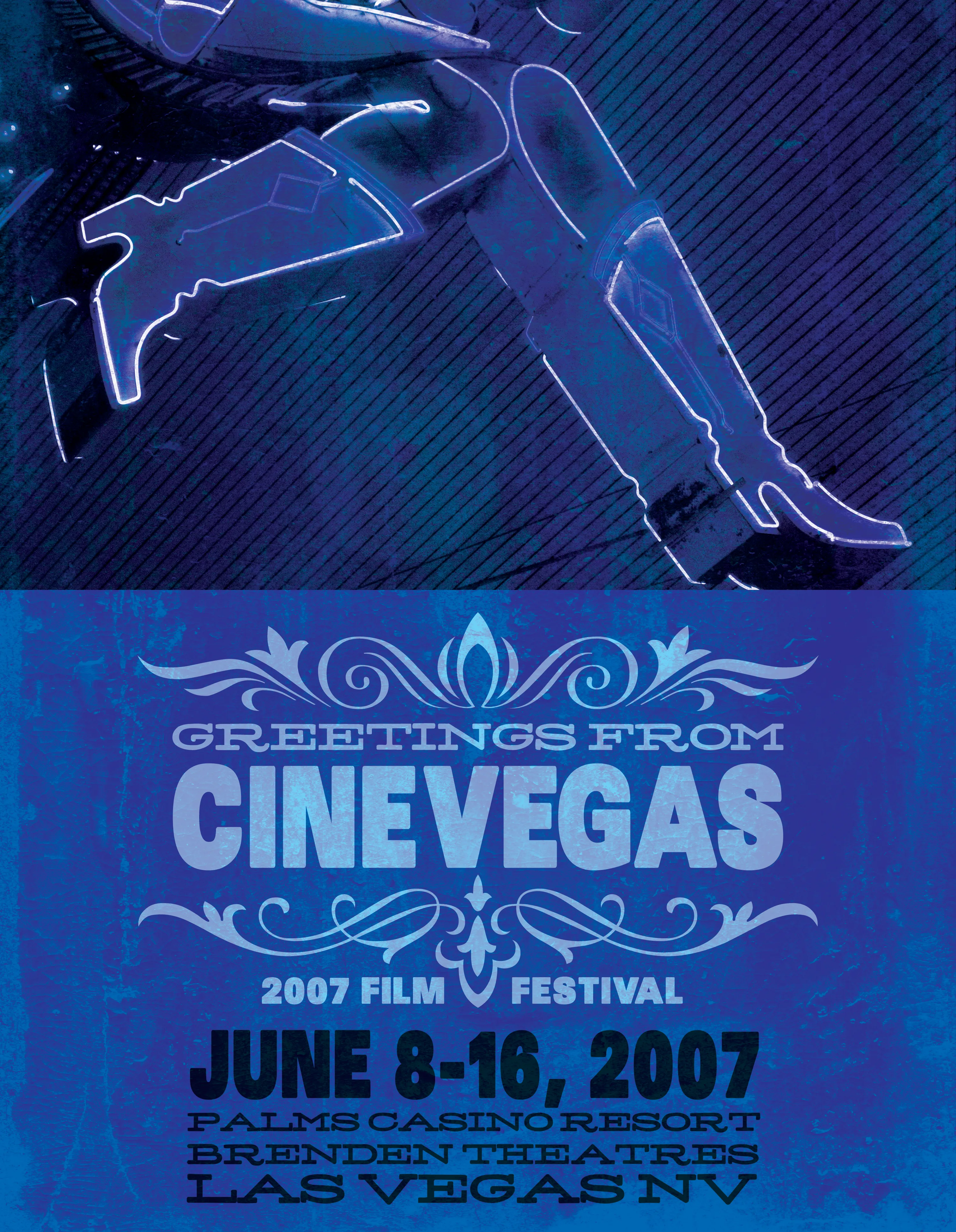
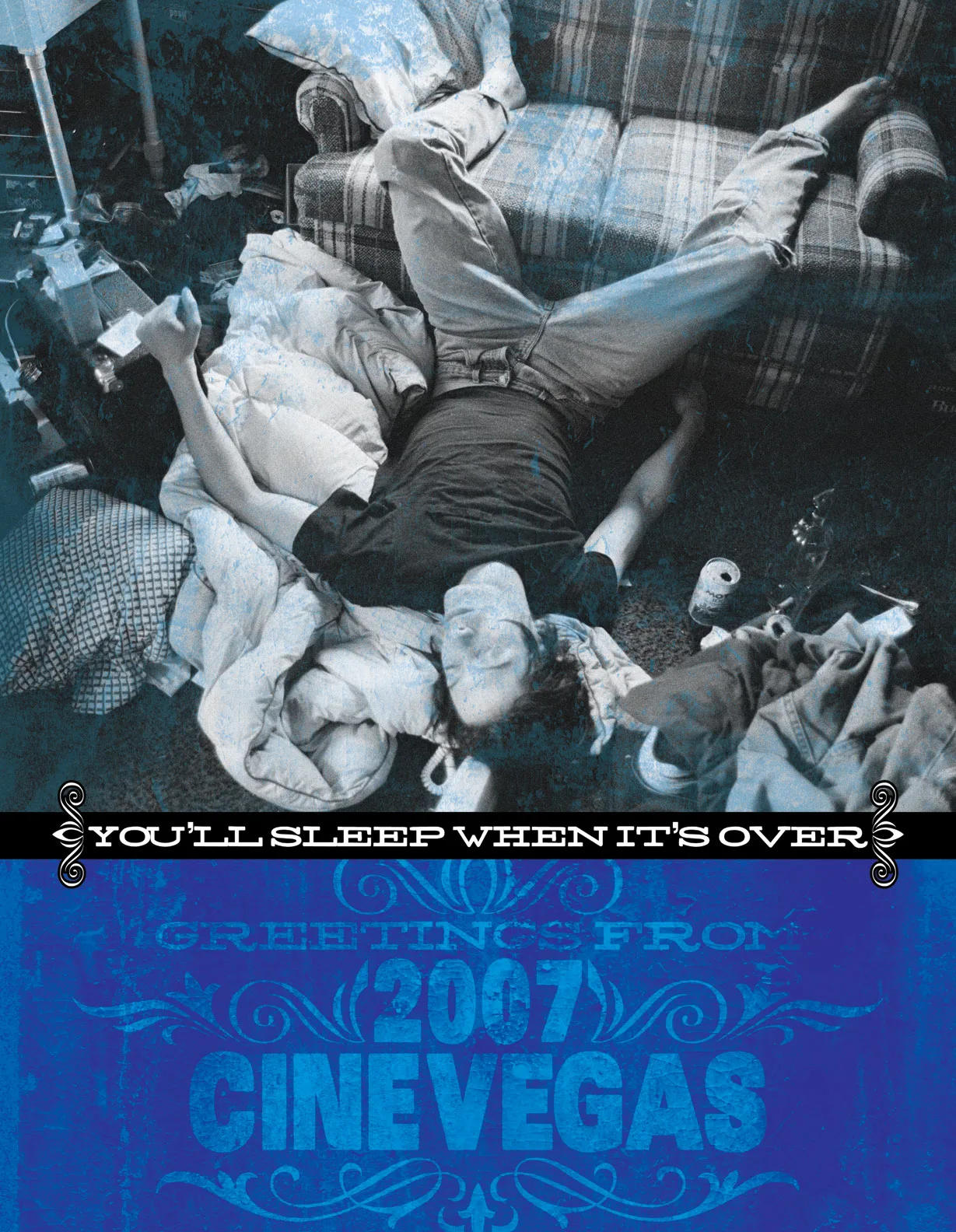
The 2007 campaign used a “Greetings From CineVegas” postcard format, riffing on American road-trip ephemera for a festival set in the most overdesigned city in the country. Poster variations pulled from different corners of Las Vegas iconography: chapel kitsch, Strip signage, neon showgirl silhouettes. A full-page AFI magazine ad used the same postcard format at print scale, cutting film stills into the letterforms. The “You’ll Sleep When It’s Over” poster ran separately. It did not need the frame.
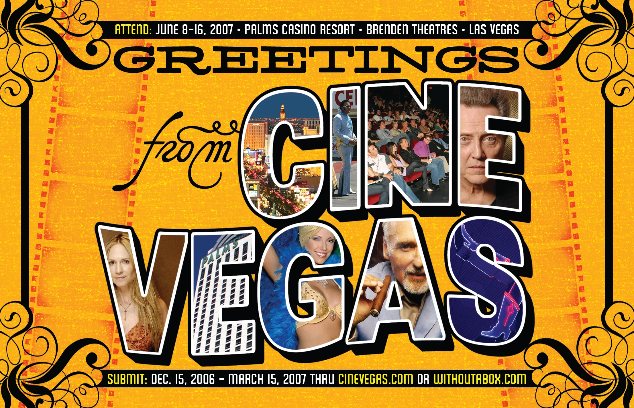
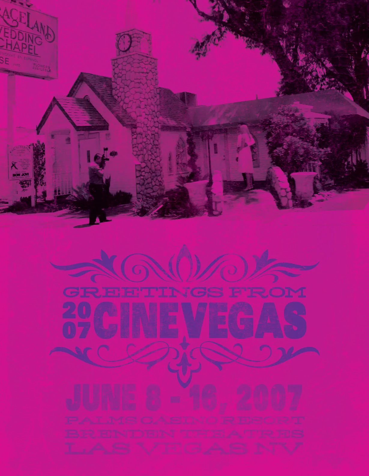
AFI magazine ad: the "Greetings From CineVegas" postcard at full-bleed print scale. Film stills cut into the letterforms, filmstrip border, Las Vegas kitsch at full deployment. Chapel poster: the Graceland Wedding Chapel duotoned in magenta. Las Vegas as a film location. Tourist strip poster: the Strip's commercial signage as backdrop, printed in yellow and red on a vertical card. Legs poster: neon-outlined showgirl silhouette in electric blue. No introduction required for a CineVegas audience. "You'll Sleep When It's Over": the 2007 tagline poster. The man on the floor said it all.

Festival collateral

The campaign had to work beyond posters. It moved through invitations, CineFile, passes, tickets, and the pocket guides attendees used all week.
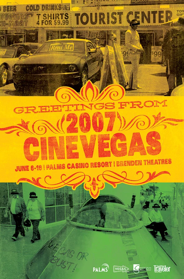
A vertical CineVegas poster combining yellow Tourist Center photography, a green vehicle marked Vegas or Bust, and red Greetings From CineVegas lettering.
Festival poster: two pieces of roadside Las Vegas met across a loud yellow-and-green field, with the postcard lettering holding the composition together.
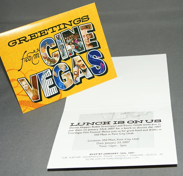
A folded Greetings From CineVegas invitation with film stills filling the postcard-style letterforms.
Park City invitation: film stills filled the postcard letters on the cover; the January 2007 luncheon details sat alone inside.
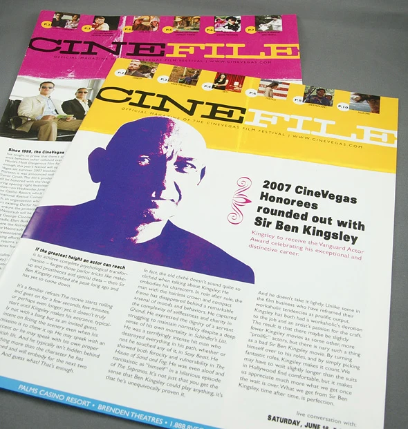
Two overlapping CineFile magazine layouts, including a 2007 honoree feature on Sir Ben Kingsley.
CineFile honoree issue: the contents grid and Sir Ben Kingsley feature shared the campaign’s hot color palette without giving up editorial hierarchy.
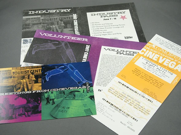
CineVegas industry and volunteer passes arranged with a festival ticket and Greetings From CineVegas postcard.
Festival credentials: industry and volunteer passes, a ticket, and the campaign postcard stayed inside one system while remaining easy to tell apart.
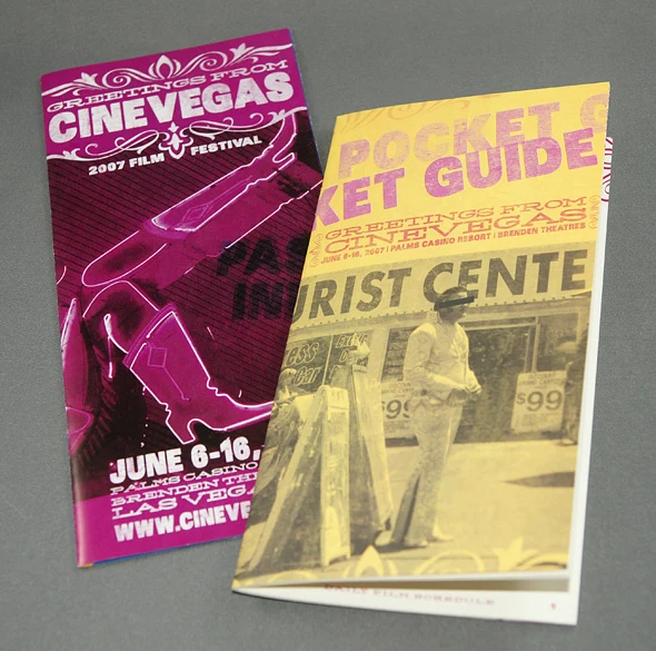
Two CineVegas pocket guides, one magenta with a neon showgirl and one yellow with Tourist Center photography.
Pocket guides: the campaign shifted from Tourist Center photography to a neon showgirl without losing the postcard frame.

Honorees and awards

The awards program gave each honoree a portrait-led card within the same color system. Hung together, the pieces turned recognition into a temporary gallery and framed the ceremony stage.
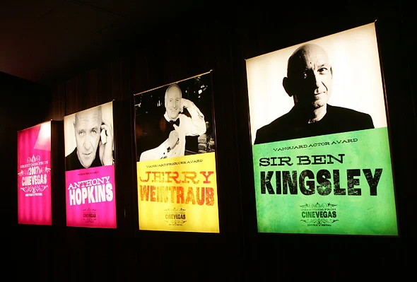
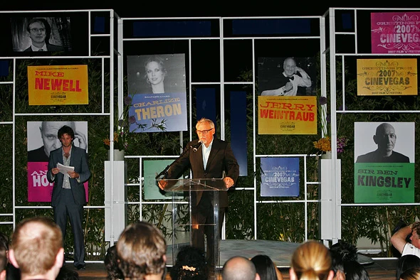
Illuminated CineVegas award banners featuring Anthony Hopkins, Jerry Weintraub, and Sir Ben Kingsley hang along a dark wall.
Honoree banners: portrait, award title, and a single saturated color made each recognition distinct while keeping the group coherent.
The 2007 CineVegas awards stage framed by portrait signs for Mike Newell, Charlize Theron, Jerry Weintraub, and Sir Ben Kingsley.
Awards stage: honoree portraits and campaign cards framed the lectern, carrying the recognition system into the live ceremony.

”Frank Booth Has A Posse”

Festival sticker for the 2007 CineVegas screening of Blue Velvet. Dennis Hopper’s Frank Booth riffed on the Andre The Giant Has A Posse street art template. CineVegas audiences got it immediately.
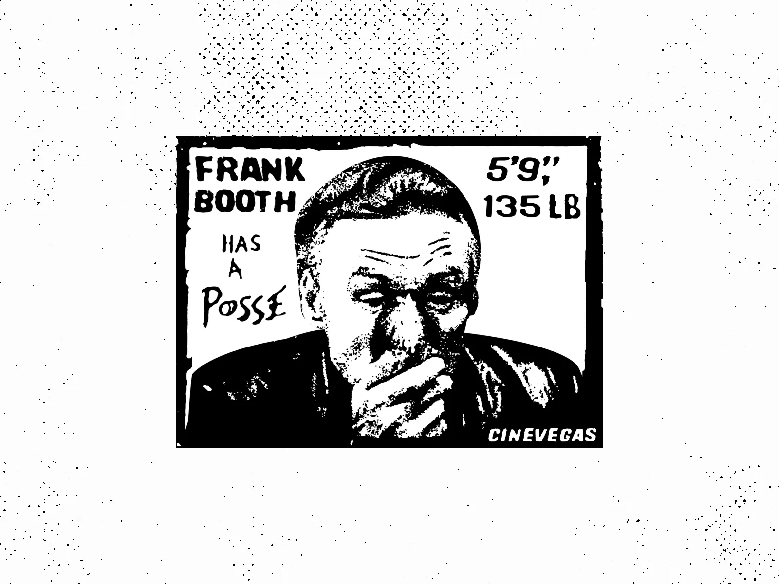
Frank Booth Has A Posse sticker: Dennis Hopper's Blue Velvet villain in the Andre the Giant street art format.

2008: CineVegas X

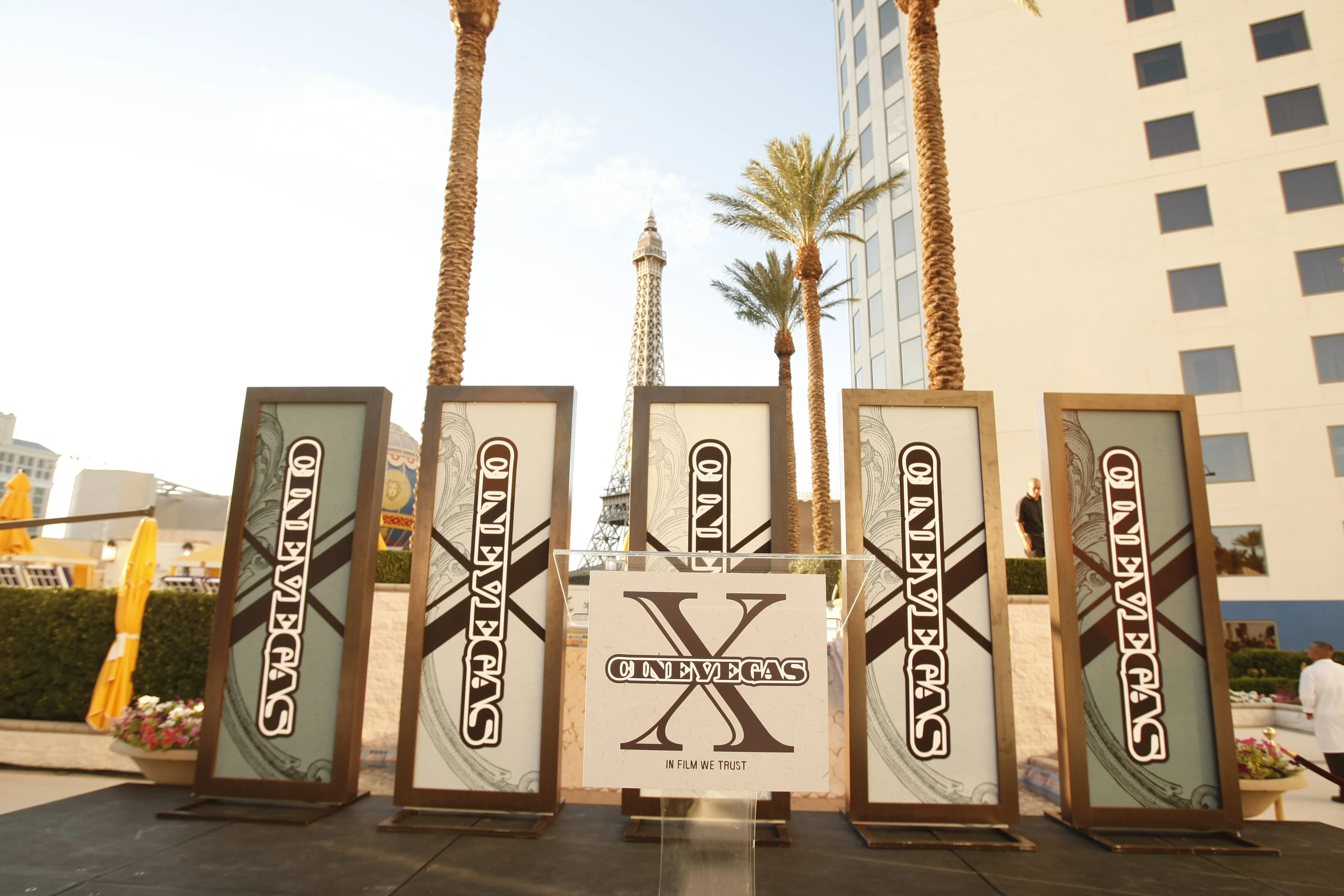
The 10th anniversary needed to feel bigger without becoming corporate. The CineVegas X mark, a hard-edged roman numeral bisecting the wordmark, ran across everything from key art to environmental signage at the Palms Casino Resort. The main poster referenced Michelangelo Antonioni’s Blow-Up: a photographer looming over his subject, Las Vegas skyline below, “In Film We Trust” as the tagline. Signage ran from a banner across the porte-cochere to step-and-repeat backdrops in the press interview room and branded boards at the outdoor awards ceremony.
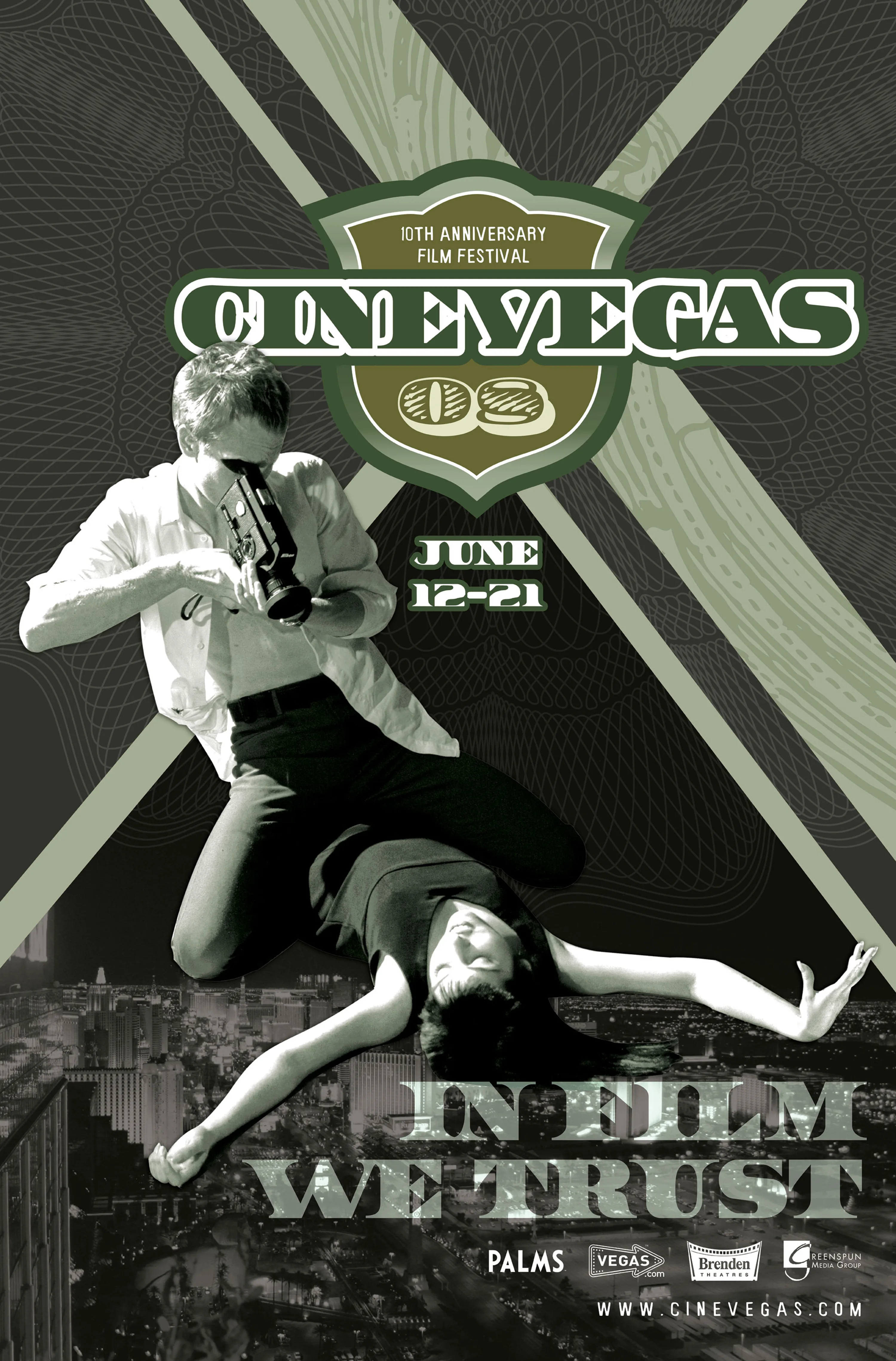
Blow-Up poster: the 10th anniversary key art. Antonioni's Blow-Up as the visual reference, "In Film We Trust" as the tagline, the Las Vegas Strip in the frame below.
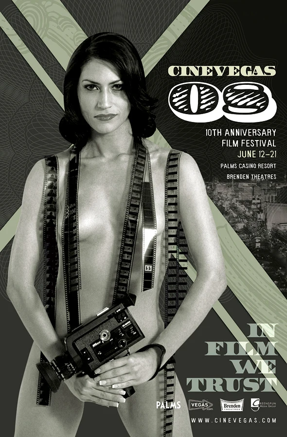
CineVegas 10th anniversary poster featuring a woman holding a film camera beneath the CineVegas X mark and In Film We Trust tagline.
Alternate key art: a film camera and strips of film carried the anniversary campaign’s “In Film We Trust” line.
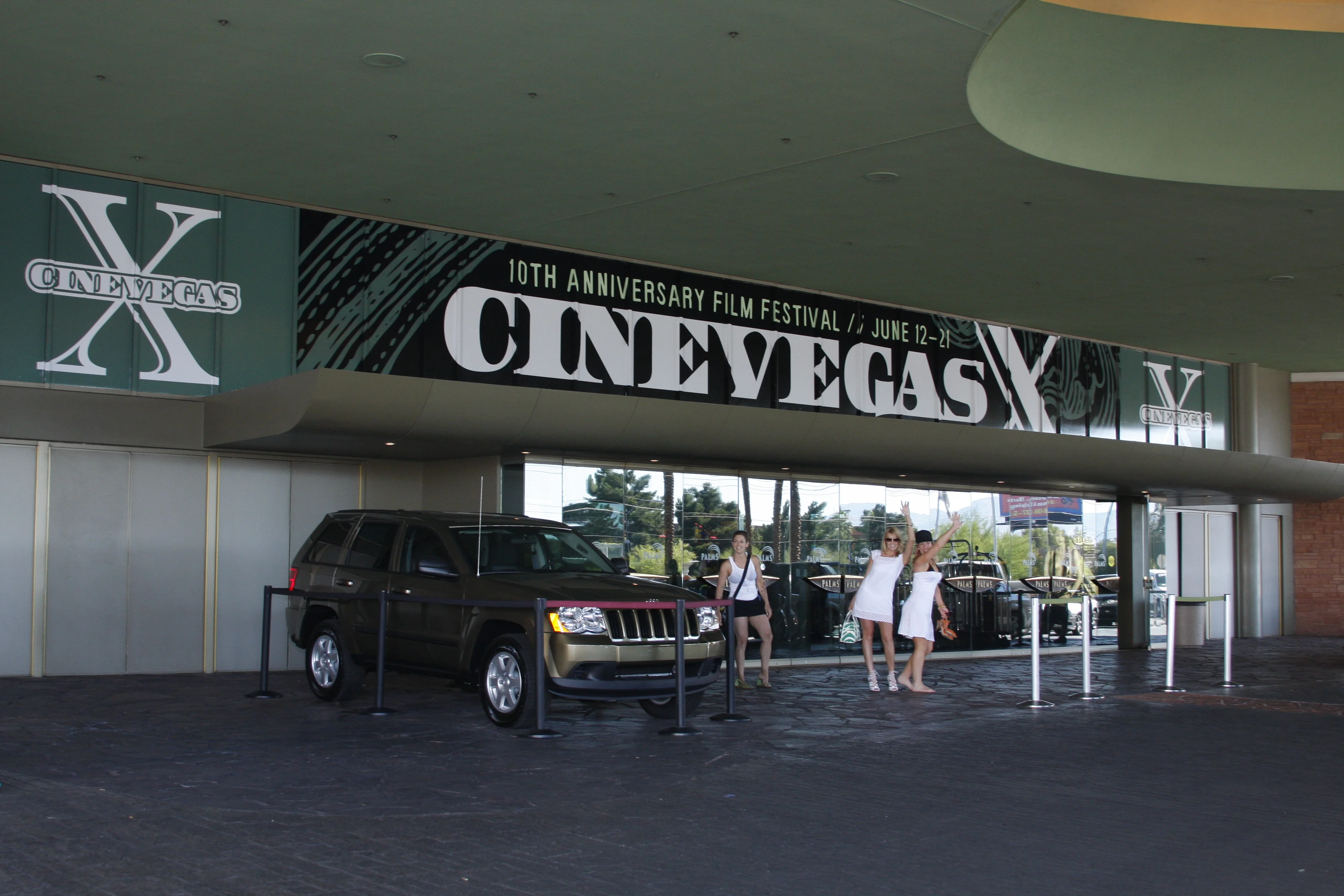
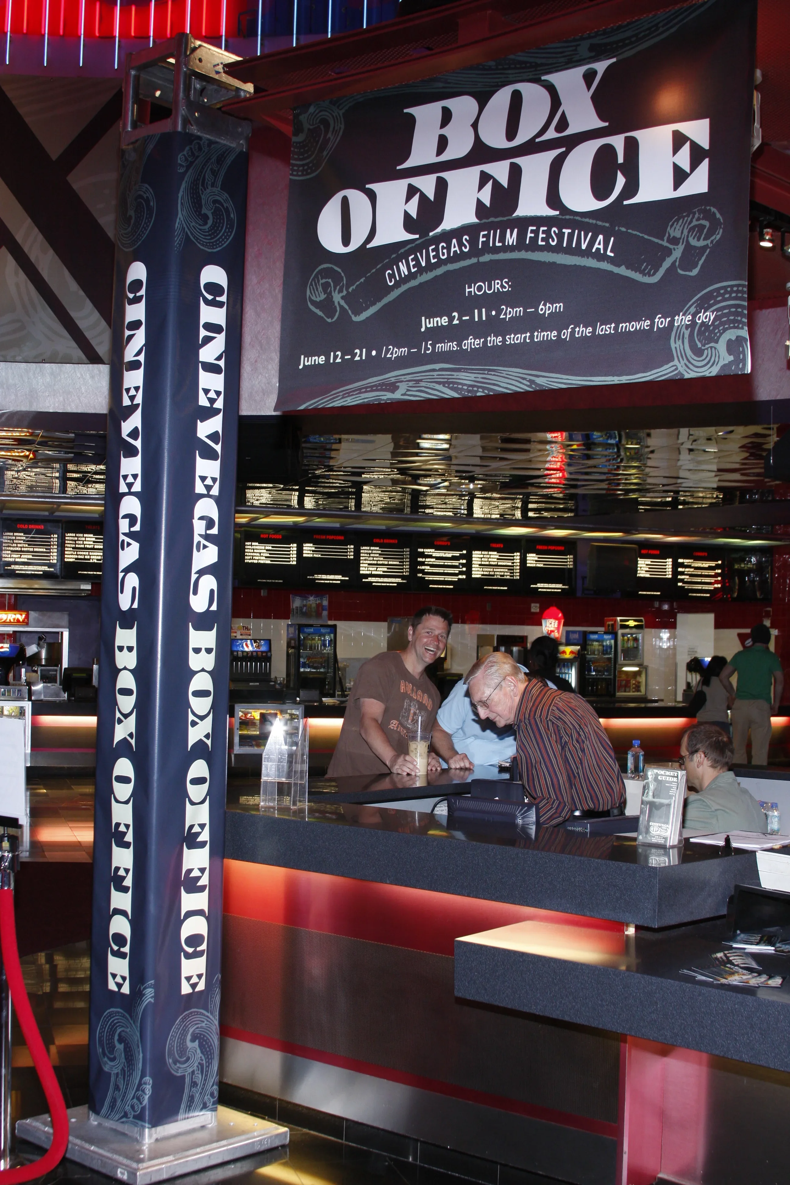
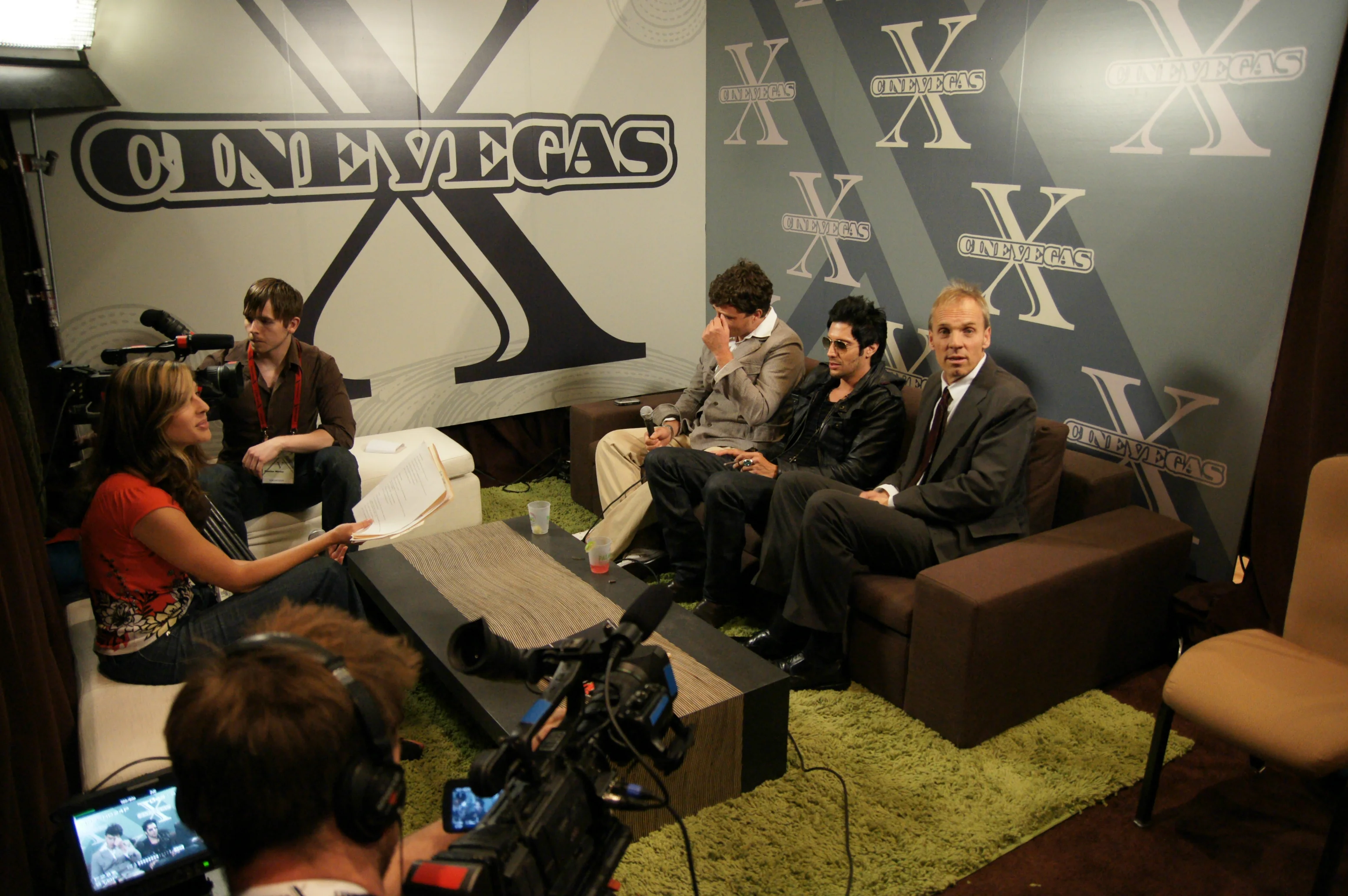
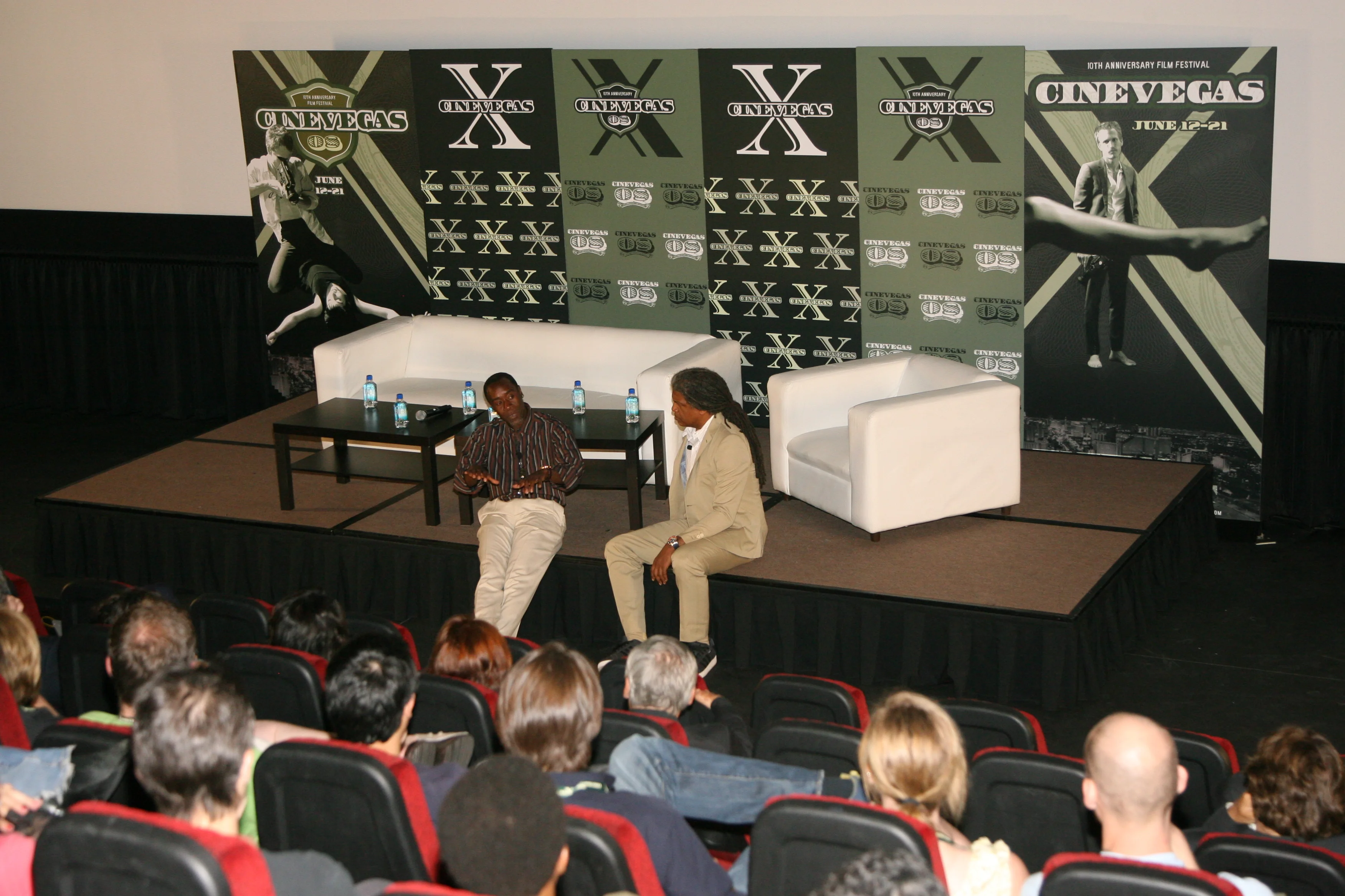
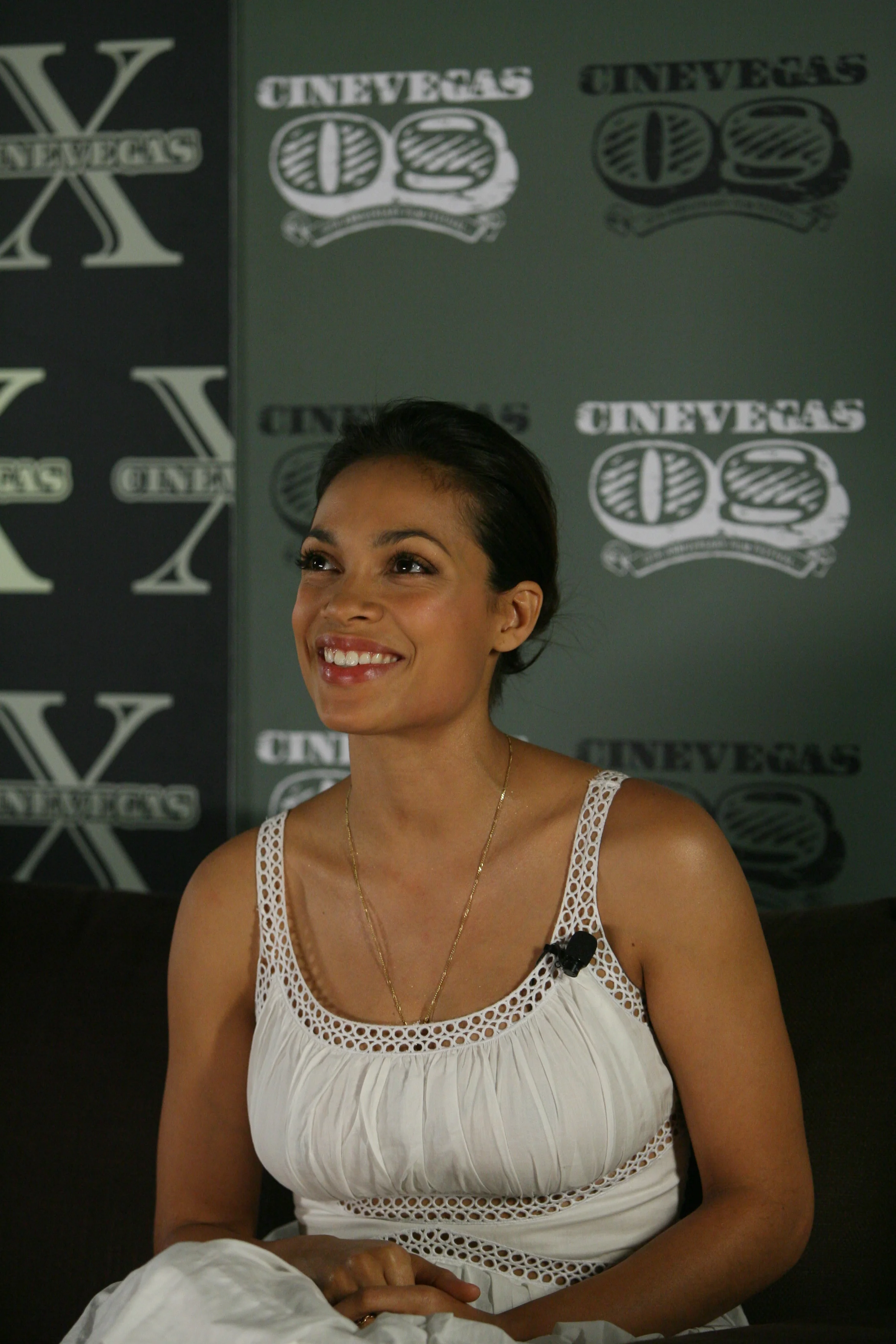
Porte-cochere banner: the CineVegas X wordmark spanning the full width of the Palms Casino Resort entrance drive. June 12-21, 2008. Lobby banner: interior signage at the Palms main entrance, the anniversary mark printed at scale. Box office signage: the CineVegas ticketing counter at the Palms. The logo ornament runs across the full fascia of the counter. Press interview room: the CineVegas X step-and-repeat backdrop in the on-site media suite. Designed so the logo hit every camera angle. Q&A staging: the branded backdrop for post-screening Q&A sessions, with a panelist on stage and an audience visible from behind. The poster's imagery repeats across the full width. Talent on the branded step-and-repeat: the CineVegas press backdrop, the mark in every frame. Awards ceremony boards: five freestanding CineVegas X panels at the outdoor awards event, the Paris Las Vegas Eiffel Tower replica visible behind them.
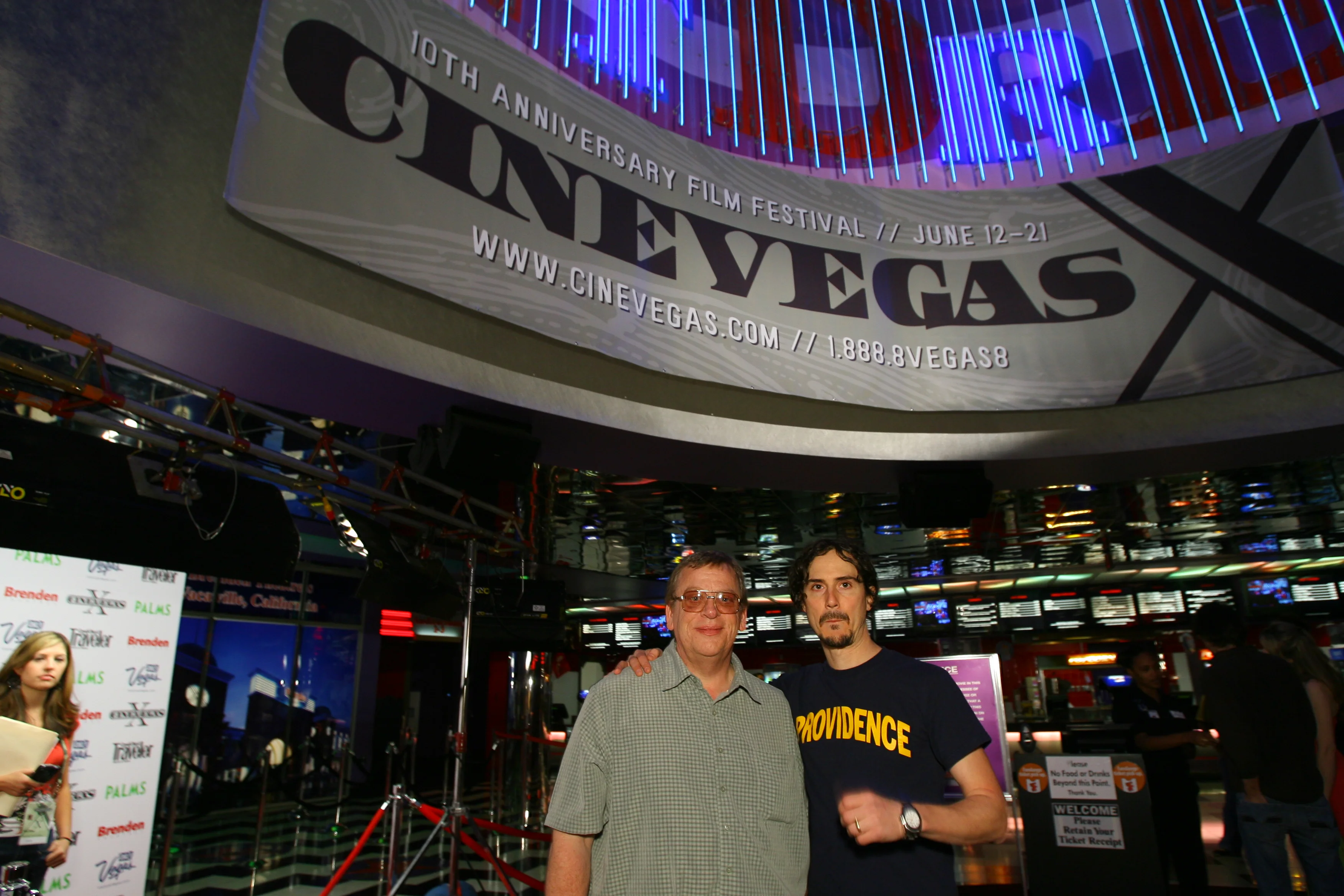
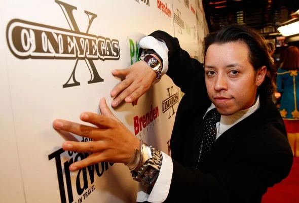
A festival guest poses in front of a CineVegas X sponsor wall at the Palms Casino Resort.
Festival portrait: the CineVegas X mark held its place among venue and sponsor logos on the event’s step-and-repeat wall.

CineFile Magazine

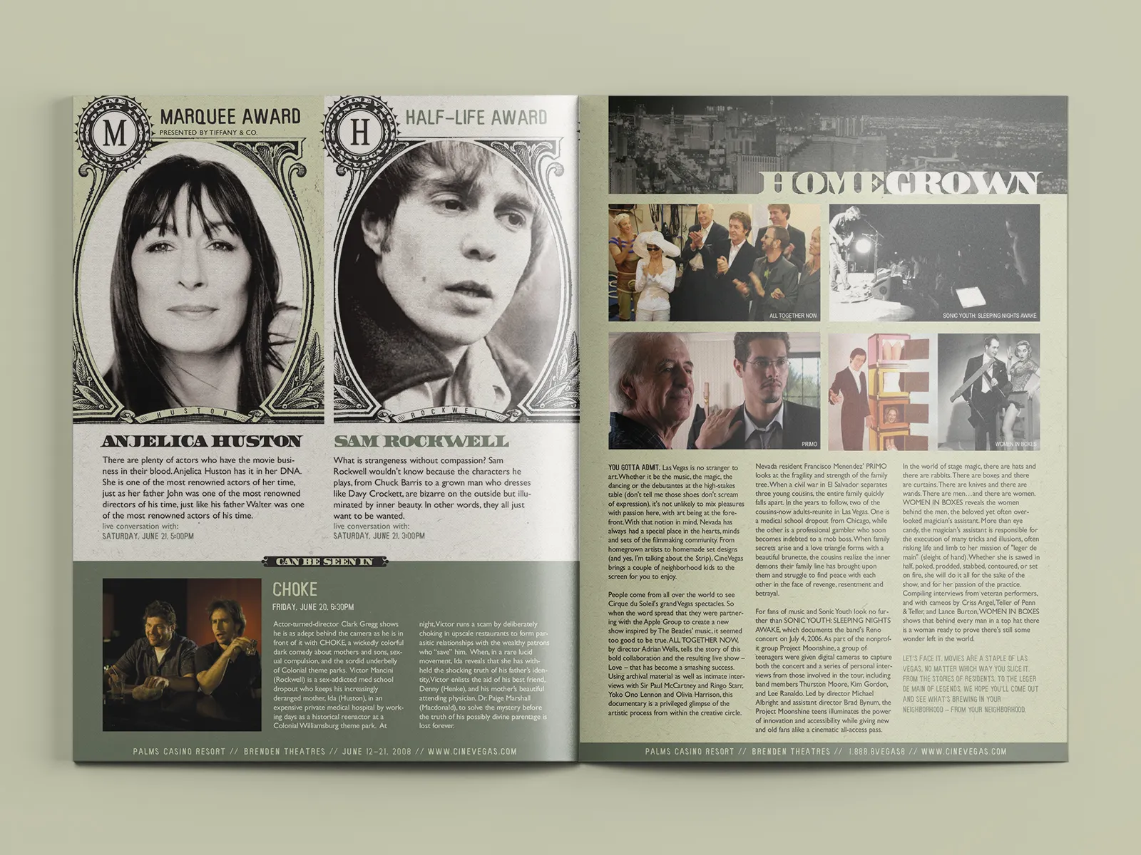
CineFile was the official festival publication: program guide, editorial companion, and the thing people carried between screenings. The design had to let listings and criticism coexist without making either feel like filler.
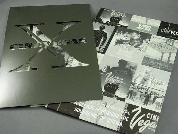
A metallic CineVegas X folder with a die-cut cover arranged beside a printed retrospective of the festival's first decade.
Anniversary collateral: a metallic die-cut CineVegas X cover sat beside a printed retrospective of the festival’s first decade.
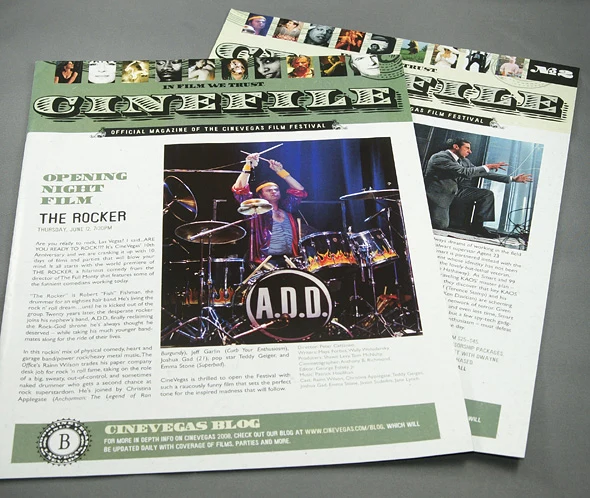
Two overlapping issues of CineFile magazine with editorial stories, film photography, and a strip of festival portraits across the masthead.
CineFile magazine: editorial stories, film photography, and festival information shared a newspaper-scale page without losing their hierarchy.
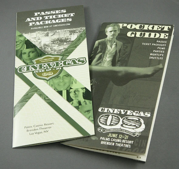
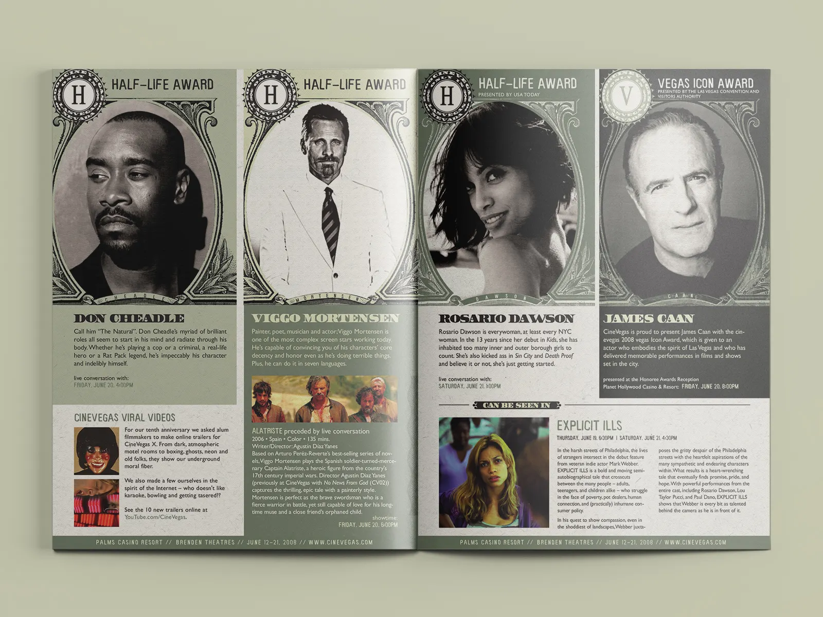
A CineVegas passes and ticket packages brochure beside the 2008 festival pocket guide.
Pocket guide and ticket brochure: two compact formats separated daily festival information from the practical details of passes, parties, and shuttles.
Interior layout: editorial and listings sharing the same grid, designed for quick scanning between screenings. Film listings and editorial: the program guide format required film data and criticism to coexist on the same spread without either getting buried.

2009: Turnin’ It Up to 11

“Turnin’ It Up to 11” was the campaign line, and the poster delivered it literally: a giant woman in yellow striding over a hot-pink Las Vegas skyline, holding a tiny car, the Palms tower below. Opening night was the world premiere of Saint John of Las Vegas with Steve Buscemi and Sarah Silverman. CineSlots launched the same week.
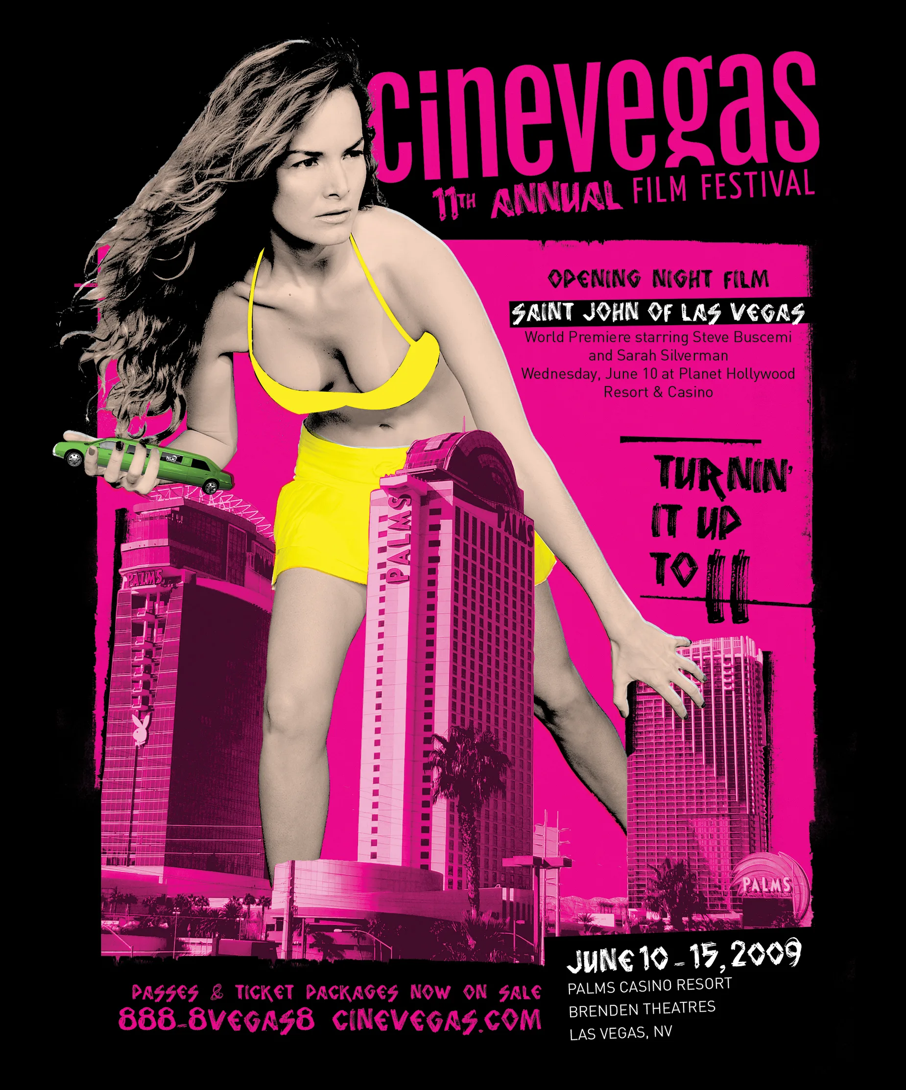
Giant woman ad: the 2009 key art. A B-movie-scaled figure over the Las Vegas Strip, "Turnin' It Up to 11" as the campaign line for the 11th annual festival.

CineSlots

CineSlots was a skeuomorphic slot machine iOS app built for the 2009 festival. Attendees pulled for random film recommendations from the festival program. The mechanic fit the setting, which is usually the difference between a gimmick and an idea.
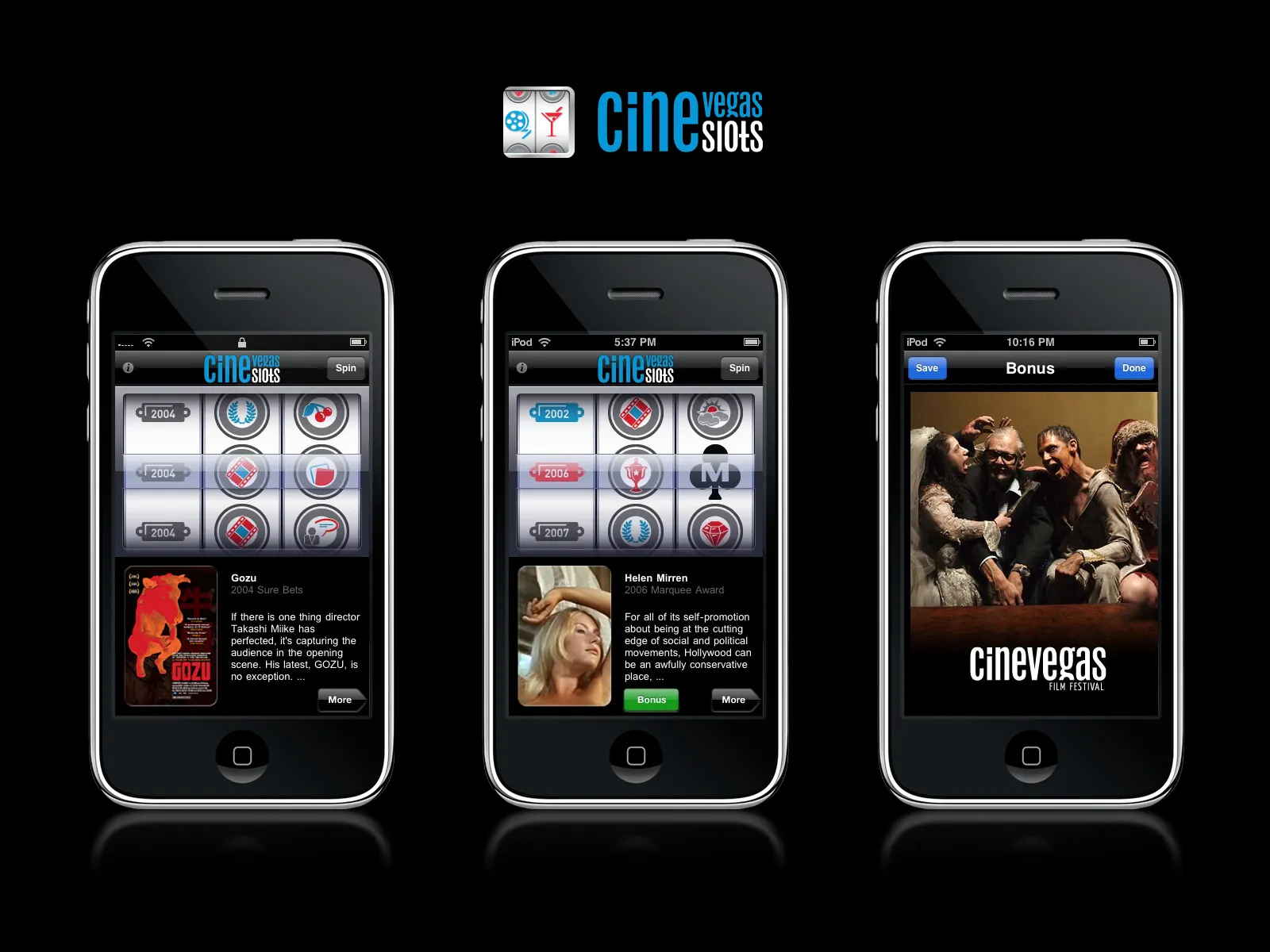
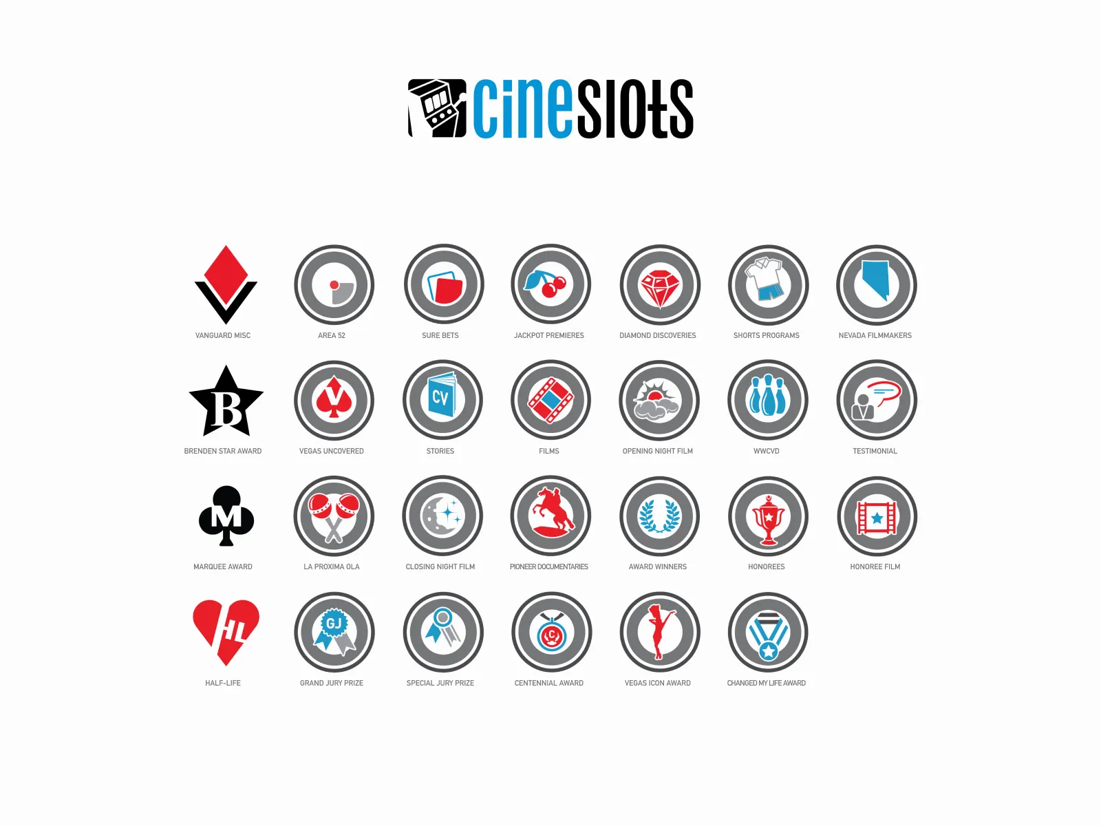
CineSlots: the slot machine mechanic as film discovery. Pull for a random recommendation from the festival program. Pure Las Vegas energy applied to a Sundance-adjacent problem. CineSlots icon set: casino iconography (cards, dice, reels) reframed around film genres. Built for iOS 3, when a festival app was still a novelty.

The icon set drew from classic Las Vegas casino iconography (cards, dice, reels), reframed around film genres and the festival program. Built for iOS 3, when the App Store was barely a year old.

Five years at CineVegas

The festival ran from 1999 to 2010. I was Art & Online Director for the final five years, covering print editorial, festival illustration, and mobile software. CineSlots was among the first iOS apps at a film festival.

The festival folded in 2010. The work still feels like evidence from a specific moment: independent film culture passing through Las Vegas and deciding, for a few years, to dress for the room.

← All projects