Kane Dies
Brand identity for Kane Dies, a political satire project in the tradition of Citizen Kane. Logo, wordmark, and illustration work.
- Role
- Brand Designer
- Year
- 2022
- Client
- Independent project
Kane Dies is a political satire project drawing from the iconography of Citizen Kane: the media mogul as cautionary figure, the promise of power as a long con. The brand leans into campaign poster aesthetics: bold typography, high-contrast illustration, the visual language of a political movement that knows it is a joke and commits anyway.
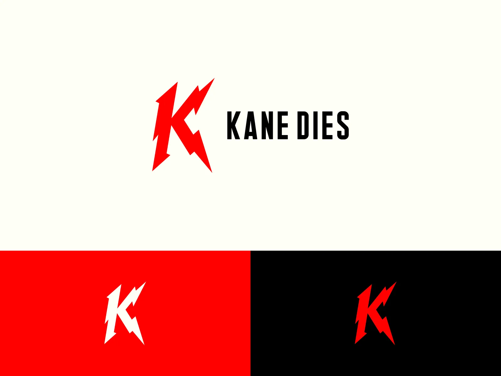
The K Mark
A standalone logomark that works at any scale, from lapel pin to billboard. The letterform reads as institutional, just loose enough to feel subversive.
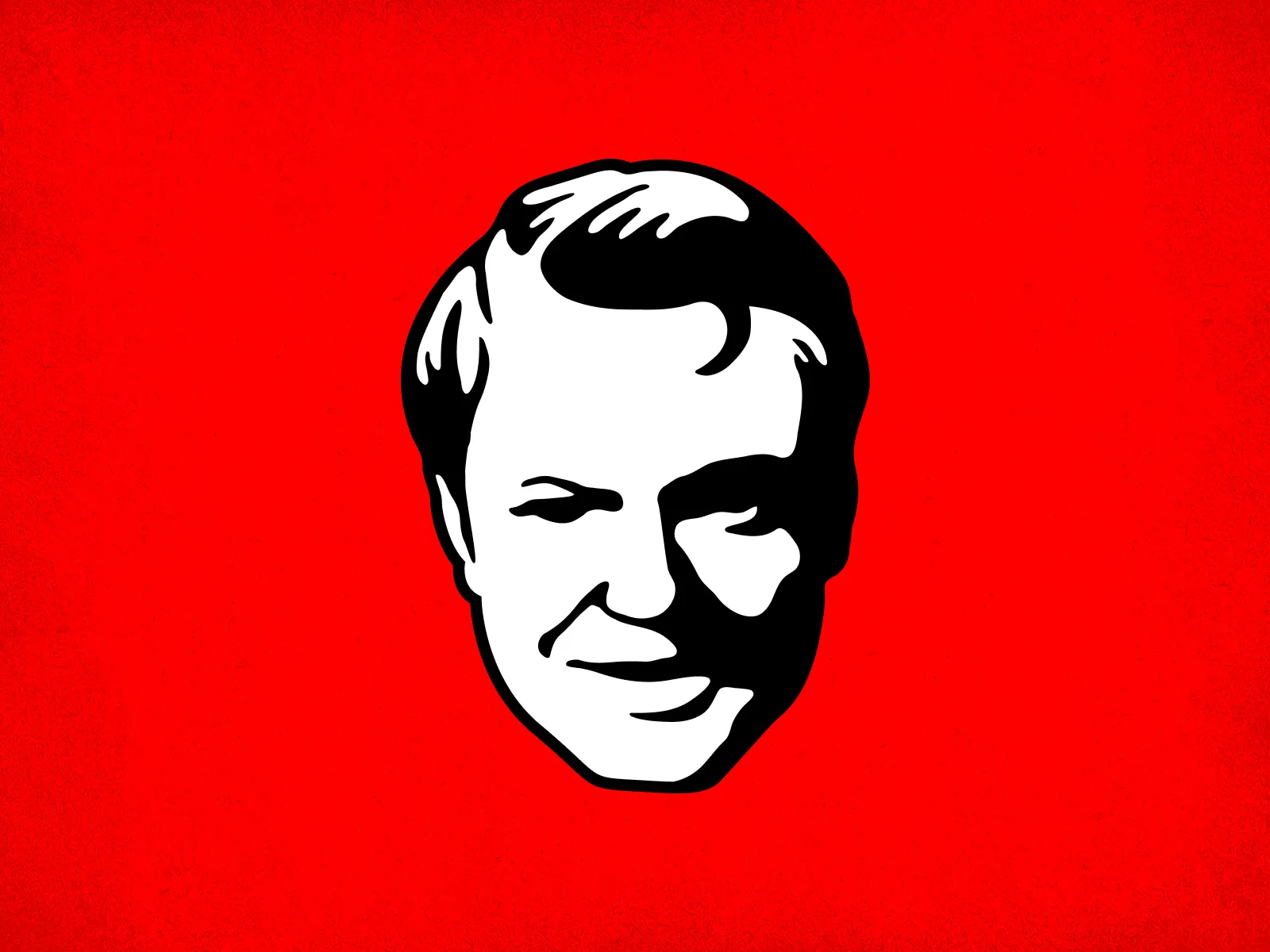
The Face
A portrait illustration built for reproduction: sticker, poster, zine cover. The style sits somewhere between woodcut and screen print: high contrast, flat color, designed to survive bad printing conditions.
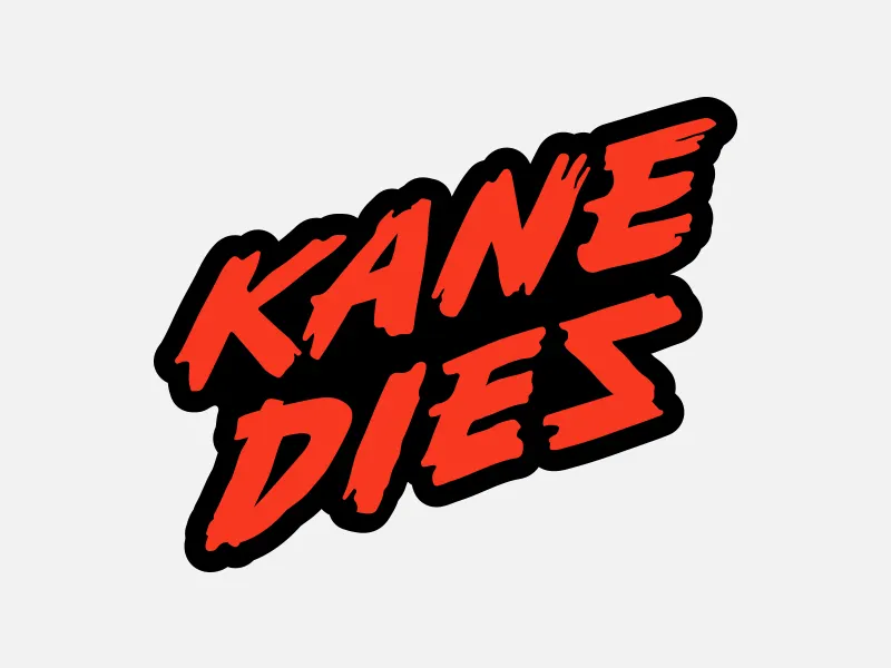
The Wordmark
The full Kane Dies logotype. Set in a condensed grotesque with deliberate tracking, the kind of type that shows up on campaign materials and protest signage. The name does the heavy lifting; the mark stays out of the way.
The system
A complete brand identity for a project that earns its absurdity by taking the execution seriously — logomark, portrait, and wordmark, all designed to hold from lapel pin to billboard. The visual language holds its satirical edge because it commits to the conventions it is parodying — campaign poster aesthetics, institutional letterforms, protest-signage tracking — rather than winking at them from a safe distance.
Interested? [email protected]