Skip to content

Fangoria Design System

A design system for Fangoria.com covering typography, color, and components. Built for horror and built to last. Foundation for a full site redesign across desktop and mobile.

FigmaDesign SystemWeb DesignTypography
Role
Lead Designer
Year
2021
Client
Fangoria

Built the design system for Fangoria.com to power a full website redesign. Fangoria has been the horror magazine for decades — the job was getting that print identity onto a screen without losing the edge.
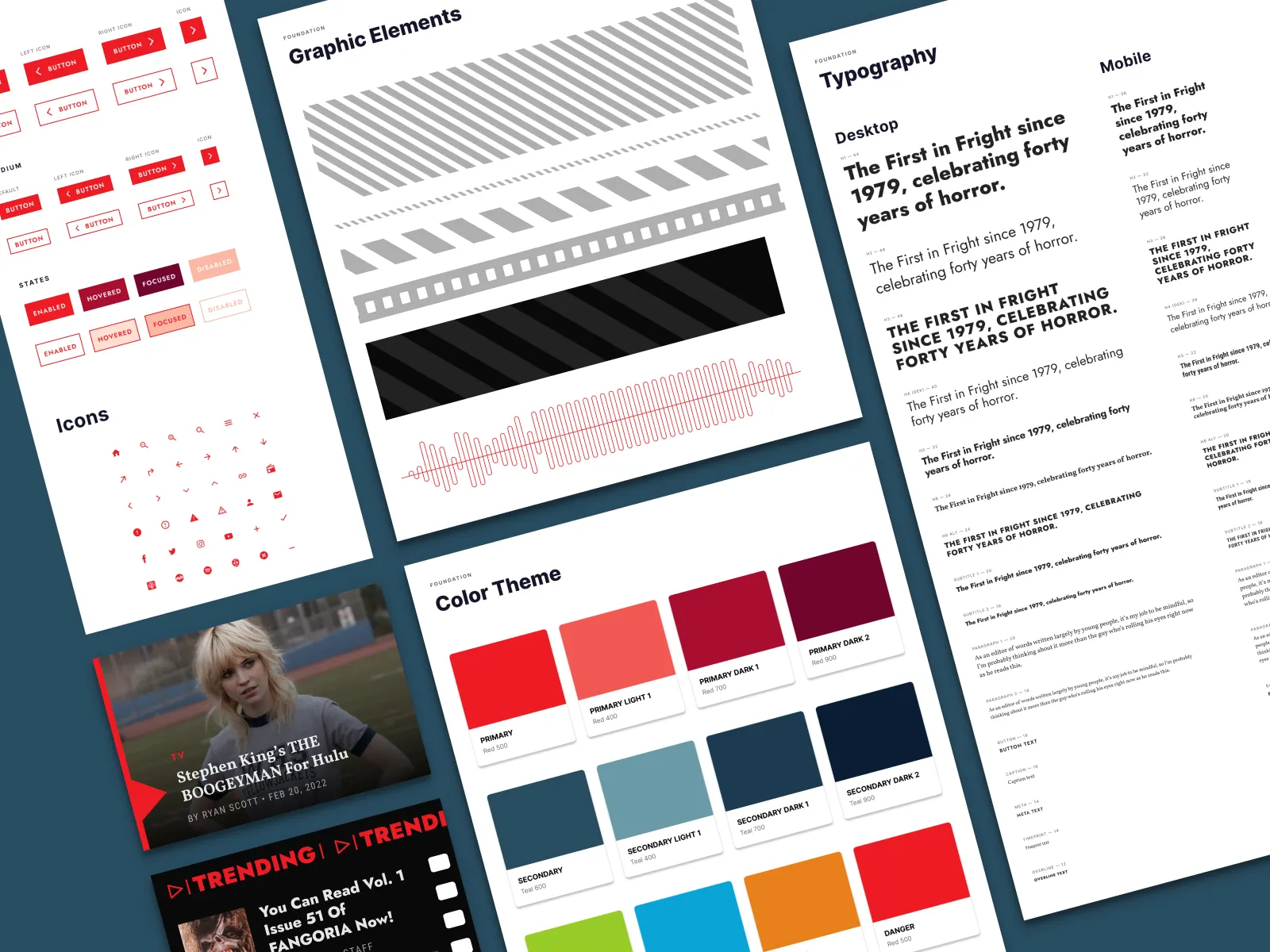
Color, type, and component overview — the full system in one view. Red and black anchored everything; no neutral palette softens the edge.

What the system covers

  • Color system, typography scale, and spacing tokens
  • Component library covering editorial layouts, article cards, navigation, and media
  • Responsive behavior documented for desktop and mobile breakpoints

Carrying Fangoria’s print DNA into digital

  • Leaned into Fangoria’s red-and-black print heritage rather than sanitizing it for the web
  • Condensed display type for headlines matches the magazine’s aggressive editorial voice
  • System built in Figma with auto-layout components that map to developer handoff
Typography and color token documentation — each token tied directly to its Figma variable so handoff required no translation.
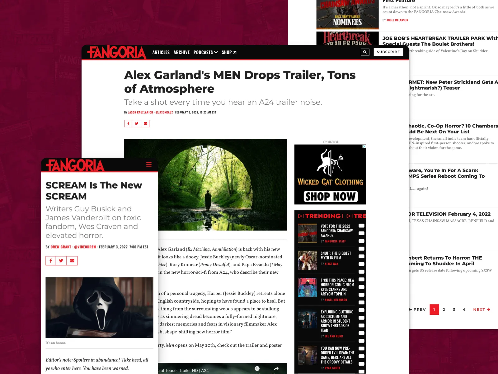
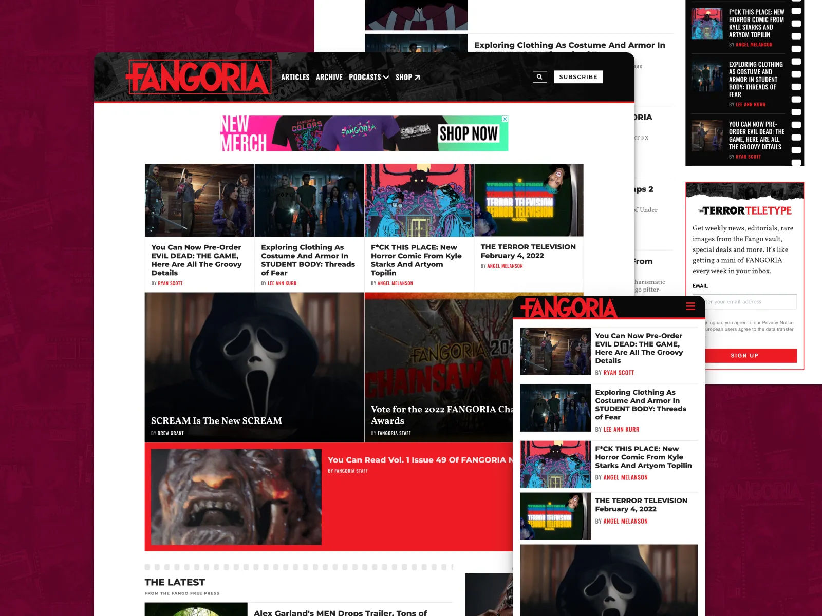
Editorial cards and navigation — the most-used components, built with auto-layout so they respond without breaking the design's aggression.
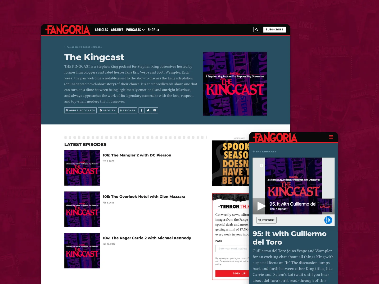
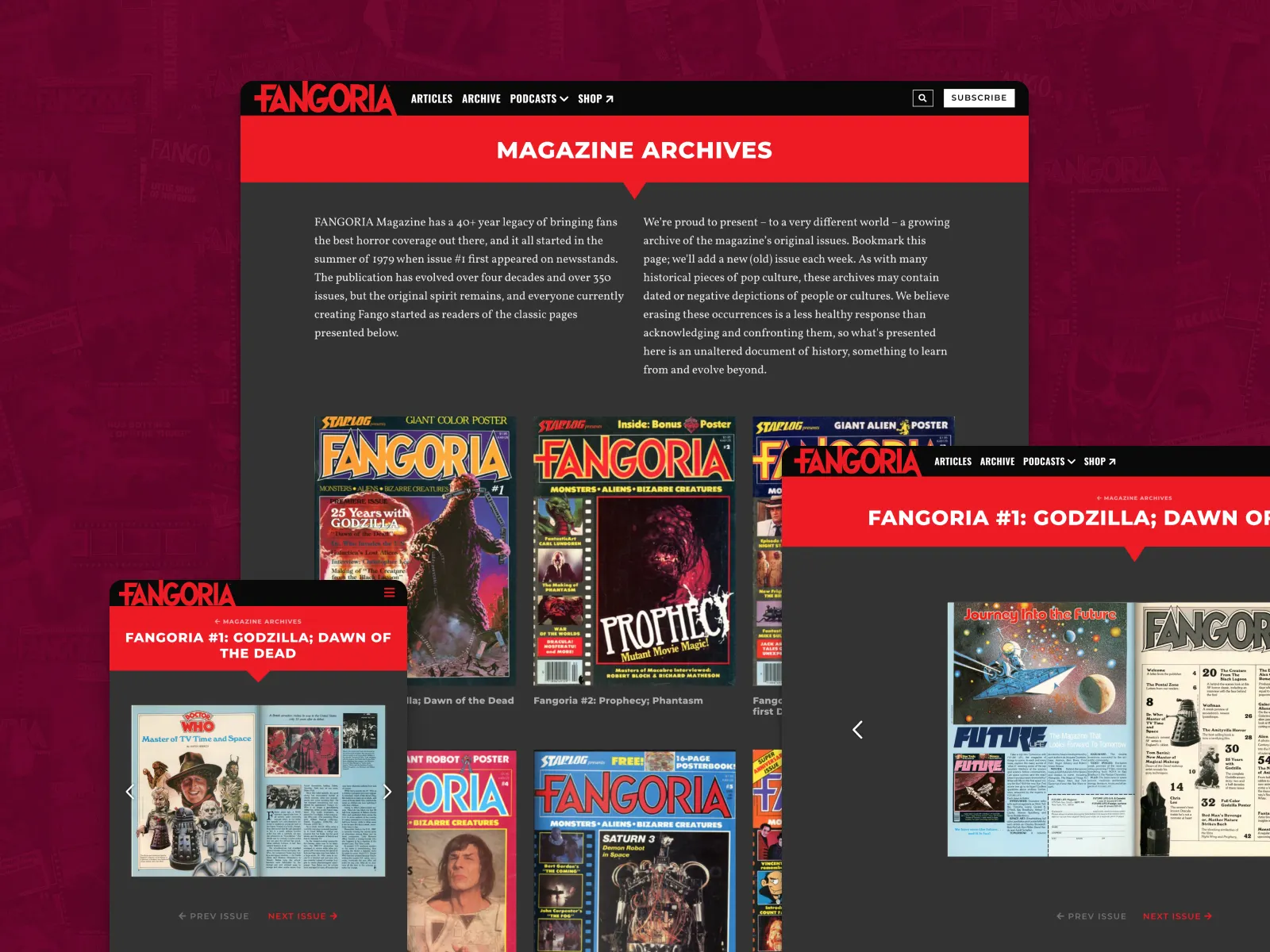
Responsive layout documentation — desktop and mobile breakpoints specified side-by-side so nothing was left to developer interpretation.
Mobile component variants — the same editorial voice at smaller scale, without rounding the edges to fit a mobile-friendly mold.

What it unlocked

The system powered Fangoria’s full website redesign, giving the engineering team a complete library of tokens and components they could build against without continuous design input. Leaning into Fangoria’s print heritage rather than normalizing it for the web meant the brand arrived on screen recognizably intact. A design system that hedged would have produced a site that looked like every other entertainment brand; this one didn’t.

The live site
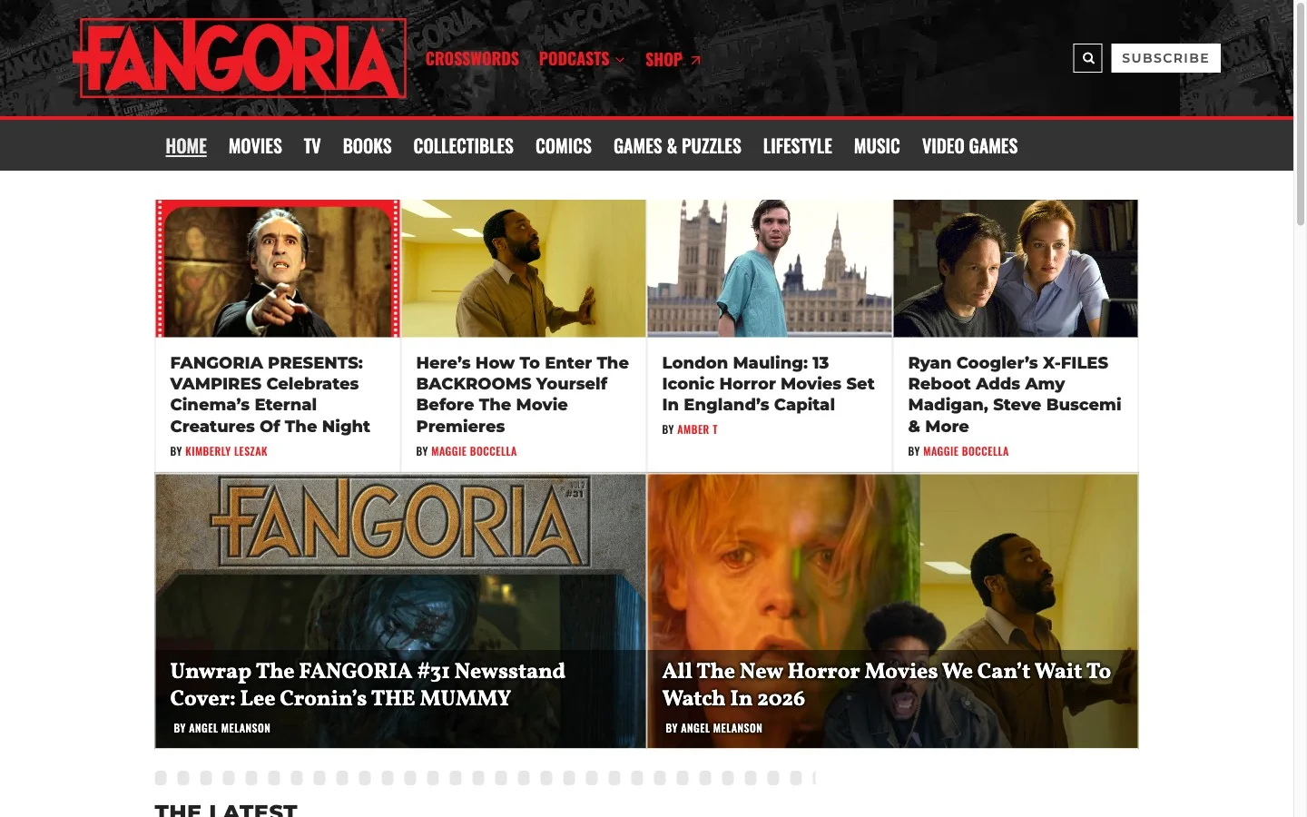
Homepage of Fangoria.com — the hero carousel, global nav, and featured article grid. Red, black, and condensed type carry the print identity onto screen without softening it.
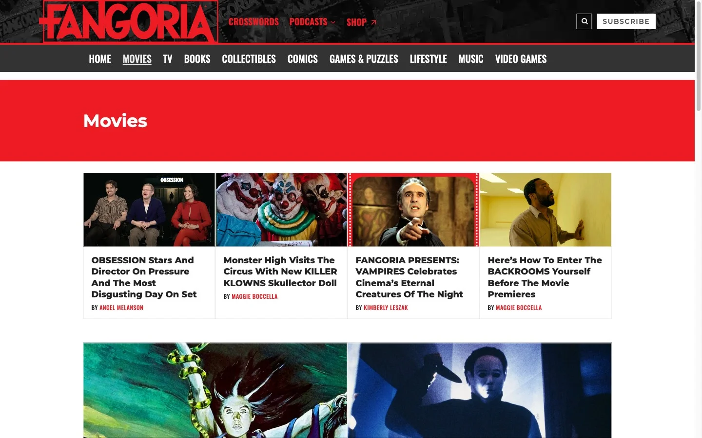
Movies section — the category landing page pattern: red header band, four-column article grid with image thumbnails, author bylines in the label typeface.
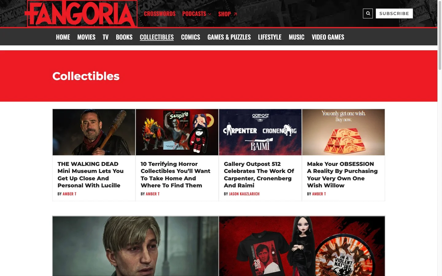
Collectibles section — same grid system applied to a different content type, showing how the component library flexes across editorial categories without losing visual consistency.
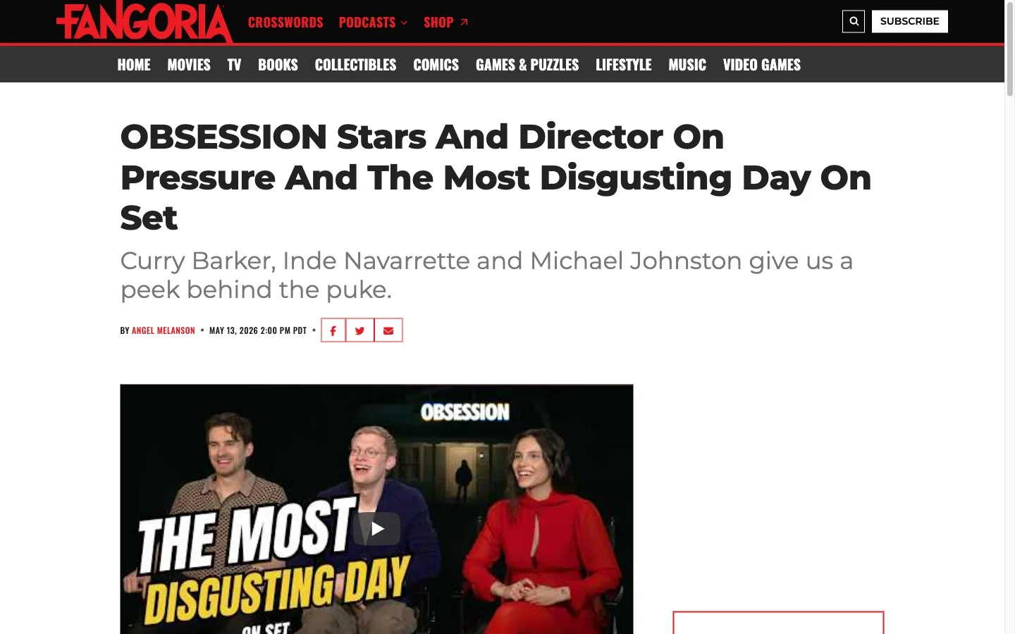
Article page — the reading experience: large condensed headline, deck, byline row, and featured video. Typography and spacing tokens from the design system govern every element on the page.
← All projects